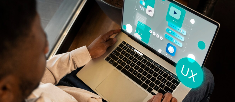
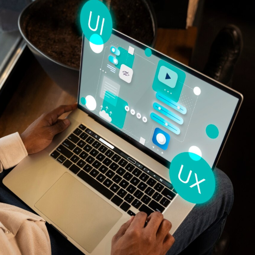
In today's digital age, having a responsive website is crucial for reaching users on various devices, from desktops to smartphones. One of the key techniques for creating a responsive website is using CSS Media Queries. This method allows the website's display to automatically adjust to the visitor's screen size, providing an optimal user experience. If you want to create a professional responsive website, our team Web Developer Indonesiaready to help with quality website creation services.
CSS Media Queries work by detecting device characteristics such as screen width, resolution, and orientation. They then apply different CSS rules accordingly. For example, you can specify that a website's layout should change from multiple columns to a single column when accessed from a smartphone.
To create a responsive website using media queries, first define a breakpoint, which is the screen width at which the display should change. For example, you could use@media (max-width: 768px)to customize the display for your tablet or smartphone. Within these settings, you can change the font size, hide certain elements, or change the layout to make it more user-friendly.
Additionally, use relative units such as percent (%) or viewport width (vw) rather than fixed units such as pixels, so that elements on the page can flexibly adjust to the screen width.
With the help of Web Developer IndonesiaYou don't need to worry about the technical aspects of creating a responsive website. We're ready to provide proven design and development solutions using modern CSS techniques, including media queries, so your website displays optimally on all devices.
Want your website to be easily accessible and look its best on a variety of devices? Get it now contact Thriveand get professional responsive website creation services from our team of experts.


 Industrial Robotics Integration
 IT Outsourcing Service
 Secure Internet SD-WAN Connection
 Digital Marketing Service