

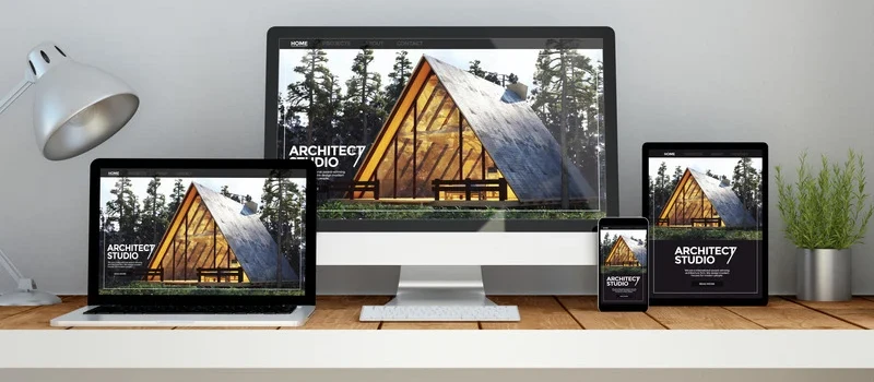
Jika Anda memiliki website lama yang belum responsif, mengubahnya bisa menjadi langkah penting untuk meningkatkan pengalaman pengguna dan SEO. Namun, tantangan besar dalam proses ini adalah bagaimana mempertahankan desain lama sambil memastikan situs Anda dapat berfungsi dengan baik di berbagai perangkat. Dalam artikel ini, kami akan memberikan tips untuk mengubah website lama menjadi responsif tanpa merusak desain, dengan bantuan Web Developer Indonesia yang berpengalaman.
1. Pahami Prinsip Desain Responsif
Desain responsif adalah pendekatan yang memungkinkan website untuk menyesuaikan diri dengan ukuran layar pengguna, baik itu desktop, tablet, maupun smartphone. Hal ini membutuhkan penggunaan grid fleksibel dan media query yang menyesuaikan elemen desain dengan berbagai resolusi layar. Jika Anda bekerja dengan Web Developer Indonesia, mereka akan memastikan bahwa website Anda tetap terlihat menarik di berbagai perangkat tanpa mengubah elemen desain yang sudah ada.
2. Gunakan Framework CSS yang Responsif
Salah satu cara paling efektif untuk membuat website lama menjadi responsif adalah dengan menggunakan framework CSS seperti Bootstrap atau Foundation. Framework ini menyediakan grid system dan berbagai elemen UI yang dirancang untuk responsif secara otomatis. Dengan menggunakan Web Developer Indonesia yang ahli dalam implementasi framework CSS, Anda bisa memastikan proses transisi menjadi lebih lancar dan cepat, tanpa merusak desain yang ada.
3. Terapkan Media Queries
Media queries adalah bagian penting dalam desain responsif. Media queries memungkinkan website Anda menyesuaikan tampilan berdasarkan ukuran layar dan resolusi perangkat. Jika Anda bekerja dengan Web Developer Indonesia, mereka akan menambahkan media queries di CSS untuk mengatur ulang layout atau menyembunyikan elemen-elemen yang tidak diperlukan di perangkat kecil, sehingga tampilan tetap optimal tanpa merusak desain keseluruhan.
4. Optimalkan Gambar untuk Perangkat Mobile
Salah satu elemen penting yang perlu diperhatikan saat membuat website responsif adalah gambar. Gambar yang besar bisa memperlambat waktu muat halaman, terutama di perangkat mobile dengan koneksi internet yang lebih lambat. Dengan bantuan Web Developer Indonesia , Anda bisa mengoptimalkan ukuran gambar menggunakan teknik seperti lazy loading dan menggunakan format gambar modern seperti WebP. Ini memastikan gambar tampil dengan kualitas baik tanpa mengurangi kecepatan situs di perangkat mobile.
5. Jaga Keterbacaan di Semua Perangkat
Tampilan teks adalah bagian yang sangat penting dalam desain web. Pastikan ukuran font dan spasi dapat disesuaikan untuk perangkat kecil, agar tetap mudah dibaca tanpa perlu zoom. Web Developer Indonesia yang berpengalaman akan menyesuaikan tipografi menggunakan unit responsif seperti em atau rem, yang akan menyesuaikan ukuran teks berdasarkan ukuran layar, menjaga keterbacaan di semua perangkat.
6. Uji Situs Anda di Berbagai Perangkat
Web Developer Indonesia yang ahli akan melakukan tes pada perangkat mobile, tablet, dan desktop untuk memastikan desain dan fungsi tetap utuh di semua layar. Pengujian ini sangat penting agar pengalaman pengguna tetap konsisten.
7. Pastikan Kecepatan Website Tetap Optimal
Web Developer Indonesia dapat membantu mengimplementasikan pengoptimalan kecepatan ini untuk memastikan website Anda responsif dan cepat.
Mengubah website lama menjadi responsif memang bisa menjadi tantangan, tetapi dengan perencanaan yang matang dan bantuan dari Web Developer Indonesia , Anda bisa memastikan bahwa desain yang ada tetap terjaga tanpa mengorbankan pengalaman pengguna di perangkat mobile. Desain responsif akan meningkatkan visibilitas website Anda, meningkatkan trafik, dan membuat pengunjung lebih puas.
Jika Anda ingin mengubah website lama Anda menjadi responsif tanpa merusak desain, hubungi Thrive. Tim kami yang berpengalaman bekerja sama dengan Web Developer Indonesia terbaik untuk memastikan transisi yang mulus dan website Anda dapat berfungsi dengan optimal di semua perangkat. Jangan ragu untuk menghubungi kami untuk konsultasi lebih lanjut!


 Industrial Robotics Integration
 IT Outsourcing Service
 Secure Internet SD-WAN Connection
 Digital Marketing Service